FINAL ASSIGNMENT (Individual Series)
______________________________________________________________


FINAL ASSIGNMENT (Individual Series)


The Works Progress Administration (WPA) was the largest New Deal agency created by Franklin Roosevelt during the Great Depression. The goal of the WPA was to employ most unemployed Americans on relief until the economy recovered. For many out-of-work artists and illustrators, that frequently meant creating posters for various local and governmental causes.
I’m attaching a folder with several images of WPA created posters. Your job is to pick one of the topics and create a modern version of that poster. You should use the same logo or phrase in the original poster (for the ones with longer phrases and extra details, you only have to use the main phrase). You can use hand-drawn or computer generated type, just make sure that your type feels cohesive with your imagery and composition.
Media: Full-color, although material is your choice.
Size: 18 x 24 inches
_______________________________________________________
For this assignment I took a simple water color of some trees, cropped it, reflected it and added some colored corners to jazz it up. Type and Design with it is always a challenge, I really never know if what I am doing looks good or not, but I tried my best to make it visually appealing. Overall I liked the way it turned out.
original: Final:
This week, you’ve received an article that’s going to be published in the Baltimore Citypaper. You’re to work on your sketch ideas in class today and have them approved by me before going home. Finals are due next week both as hard copies (for our in-class critique) and as digital files (to be e-mailed to Joe MaCleod, the art director of the Citypaper).
The article you’re illustrating is a book review, so think about the best way to visually communicate the writer’s opinion – both creatively and succinctly. When you present your digital files next week, make them look as professional as possible – clean scans, proper cropping, etc.
Media: anything you want. We won’t know until after the assignment is due whether it will run greyscale or color. So you can either just work greyscale or turn in two versions.
Size: 5” Square or proportionate
Due Dates: Sketches approved by me today and final due next week.
File information: turn in two different files next week. Label them both: firstname_lastname.
File #1: 7x7 in, 72 dpi. Jpg. RGB (or greyscale)
I emailed Deanna asking for the city paper article. Deanna's Reply:
"If you want to do the same City Paper assignment you can, but the main part of that assignment was learning to deal with deadlines deadlines - the students had to turn in sketches to be by the end of class and I gave them feedback like an art director would and then the final was due by the next week and sent to the City Paper Art Director to choose the one to get published. He also gave feedback to the other students. I'm not sure if the assignment would be as helpful without those time constraints or feedback while you'll be working on it. I'll attach the assignment and the article, but if you want to just look in any magazine that you own and pick out an article that interests you and doesn't already feature an illustration, that would still help you to work on your editorial illustration skills as well."
After hearing all that, I wasn't going to do the assignment because the point of it would really come across if i weren't in a classroom with Deanna under the time constraints. BUT, I didnt want to chance it so here is the article and my illustration.
Article:
Sweeping the Clouds Away
Exhaustive book tells you how a group of television innovators got to Sesame Street
By molly o'donnell
The children's education series Sesame Street remains a singular program in television history. On the air since November 1969, it maintains the prestige of being the first, and possibly only, show for pre-schoolers that is as educational as it is entertaining.
Former Baltimore resident and Jewish Times editor Michael Davis' Street Gang: The Complete History of Sesame Street is broad in scope yet exercises a meticulous attention to detail. This meticulousness turns out to be essential because of the number of story threads that are un-teased to paint Davis's picture.
The book faithfully traces the lives of each person who made a contribution to Sesame Street while offering interesting observations about a show with its heart in the right place and the people who gave it that heart. Everything about Davis' presentation is doggedly balanced. Although he often lavishes praise on the show, he
doesn't shy away from recounting public criticism and the personality flaws of the people behind it--such as composer Joe Raposo's obnoxious namedropping or producer Dave Connell workaholic lifestyle that led to family estrangement.
Gang has its lulls, though, simply due to the number of people involved in the show. Granted, it's important that certain contributors' lives--such as founding Executive Director Joan Cooney and muppet-creator Jim Henson--be told in detail. After a few hundred pages of life histories, however, your attention span can wane. Apparently, Davis intends the subtitle's "complete history" to be accurate.
Thankfully, the work overall is far from mercilessly dull. Its revelation of the behind-the-scenes practical jokes, binge-drinking sessions, and tensions add to its momentum. Even in the more tedious moments, Gang reads like a well-timed gift. Many of those responsible for Sesame Street's success--Henson, Jon Stone, Joe Raposo, actors Northern Calloway and Will Lee, puppeteer Richard Hunt--are dead. And the remaining members of the show's original core group are elderly.
Gang's release is timely for another reason: For the kids glued to the first season down through today's Elmo lovers, it's not readily apparent how novel the show is. There's no basis for comparison because Sesame Street was always there. It's good to know that nostalgia for rubber duckies stems from the first educational show that didn't bore its audience to tears--Sesame Street's celebrity helped teach educational fundamentals and social tolerance. Gang carefully describes how previous generations of Howdy Doody watchers didn't have the benefit of
television that was fun to watch but also infused with positive social and educational lessons.
Even if personally immune to the charm of muppets, its effect on both television and preschool education are undeniable. An ambitious project from the start, Sesame Street started with a precarious mix of public and private dollars in the hopes of gaining some freedom from commercial television's ratings obsession. This freedom allowed show creators to delve into the area of preschool education that director Cooney claims "educators were virtually ignoring" [FC: P. 68].
With the help of a team of educational researchers, the producers approached the problem of teaching while holding children's attention with novel techniques like the integration of muppets and an ethnically and socially diverse cast in realistic street scenes, a magazine format that parroted the flashy Laugh-In, and songs hat were slyly educational and amusing. Children's programming prior to Sesame Street followed either an irritatingly loud, commercial model or the slightly more soothing Captain Kangaroo, neither of which were edifying for kids or interesting
to adults.
Distilling the creative labor behind this innovation is the source of Gang's most intriguing and evocative moments. These revelations include Sesame Street's years of miraculous serendipity, staffing debt to Captain Kangaroo, fidelity to educational research that benefits underprivileged kids, and unlikely disputes with everyone from educators and Disney to feminists. It's surprising to learn that feminists would criticize a program that purposefully cast actors from almost every minority group and walk of life. Sesame Street, though, consistently got heat from groups like NOW for its dearth of female muppets and role models that were anything other than housewife types such as Loretta Long's Susan.
Such background details about the show only enrich appreciation for people who loved Big Bird as tykes. Disillusionment is inevitable when something is dissected in this way, but somehow Davis manages to keep you engaged by sharing the little-known details and emphasizing that the program was actually a series of fortuitous moments that made Sesame Street great.
______________________________________
For this project, I did it in one afternoon trying to keep to the time restraints my classmates would have had. My concept for this illustration in relation to the article is simple, the article seems to state 3 things - 1. The book was VERY long and tedious - exaggerating the book size 2. The creators were not as innocent as the characters in the show - Ominous looming Big Bird 3. The show and the history goes back very far, hence the colors are faded like a photo from the 60s when the show was created.

Choose a specific product to advertise in an illustration. You could choose a popular product from a past decade (hula hoops, the yo-yo, Ovaltine, etc) or a product with a specific brand name (Converse sneakers, Heinz ketchup, etc). You don’t have to come up with any typography, just an image that would show that product in a good light and make people want to buy it. You can choose whether you want to mimic the old vintage advertising styles from previous decades, or if you want to work in a contemporary style.
Media: Full color, material is your choice
____________________________________________________
I had recently taken a field trip to a museum in Osaka and picked up a book on advertisements from the industrial age, where all of them use printmaking. I thought it would be great to draw inspiration from for this assignment sense I was taking an printmaking class. The item I choose to advertises for was The Snuggie. I thought if would be fun to take a relativally usless, tacky, infomercial product and make into a classly 1950s ad, when design was smarter and more simplistic.
Here is my final verison:

Choose a poem of your liking to illustrate. Try to find one with imagery that really resonates with you, not just the first one that springs to mind. It can be contemporary, historical, solemn, comedic, romantic – whatever, just as long as you could find something about it that would inspire an illustration. Don’t include the final poem in the illustration, but bring a copy of it for our reference during the critique. Since this assignment is pretty open and general, use it as a means of figuring out what type of imagery really resonates with you.
** I'll be bringing tons of poetry books in all different genres to class so the students will have tons to read and sift through. (the usual suspects like: Robert Frost, Beat poets like Allen Ginsberg and Lawrence Ferlinghetti, Anne Sexton, Shakespeare, Edgar Allan Poe, Shel Silverstein, Walt Whitman, Carl Sandburg, Oscar Wilde, Dorothy Parker, Saul Williams). You can use the internet if you can't find any poetry books around you.
Media: anything you want as long as your final is in color.
__________________________________________
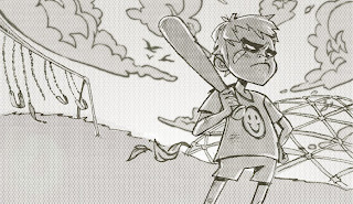
I chose to illustrate the poem "A Boy Names Sue" by Shel Silverstein
but sense it also a great Johnny Cash song with the exact same lyrics you can listen to it here
 Here is the colored version:


